Improved Logistic — logo and brand identity
About the project
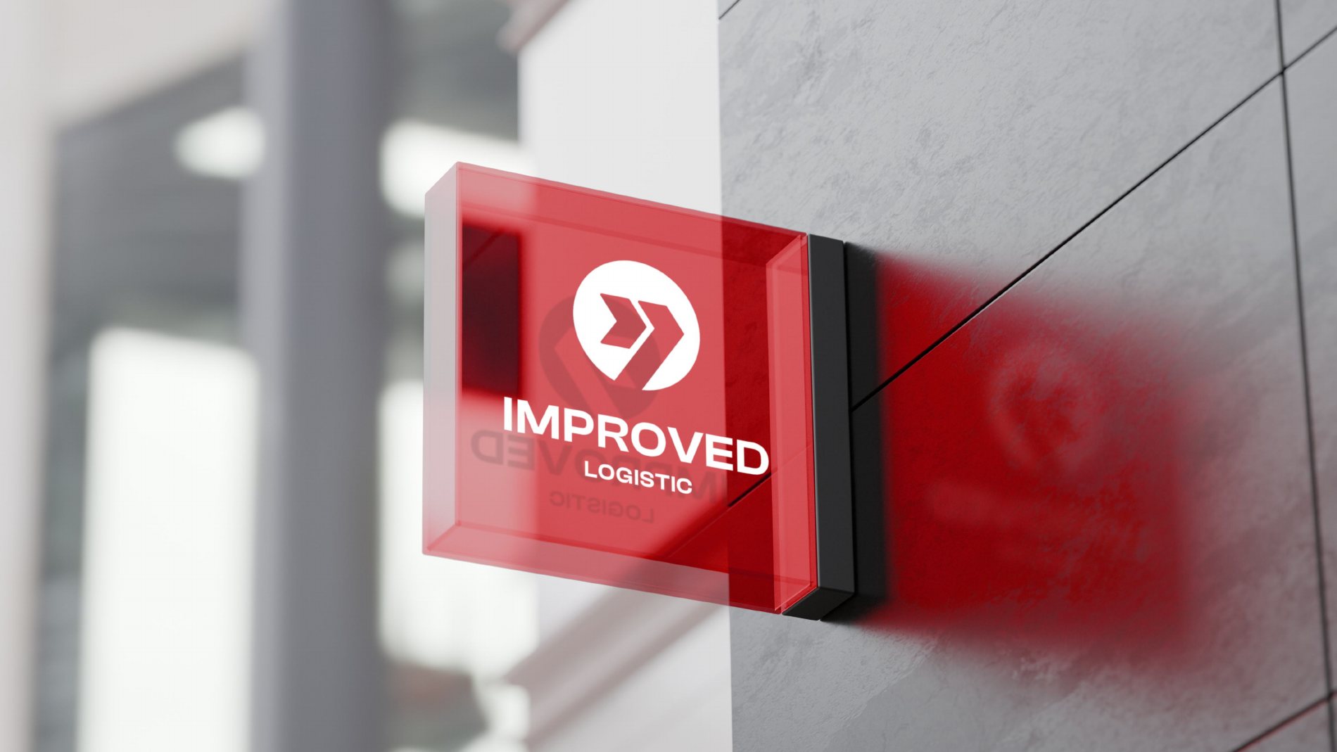
Improved Logistic is a logistics company. We designed a mark that reads in a split second — on a sign, a container or packing tape — and a full set of brand applications.
Project details
Scope: logo, palette and typefaces, applications, alternative concept
Idea
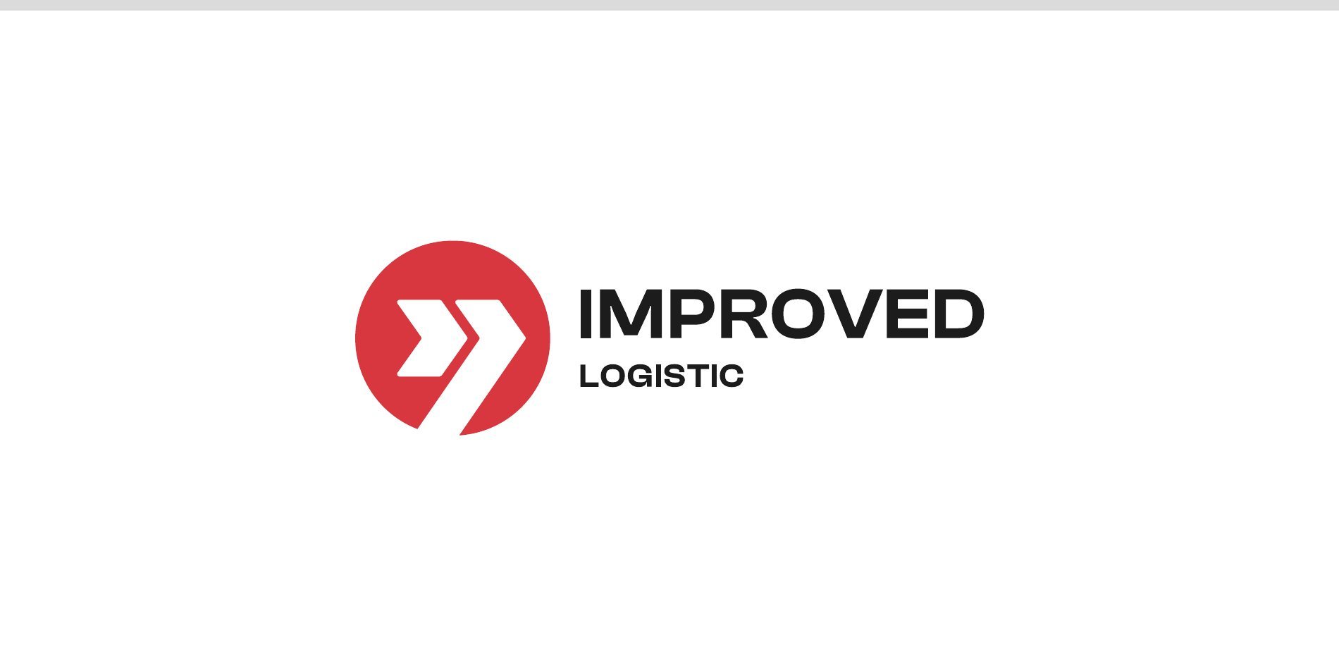
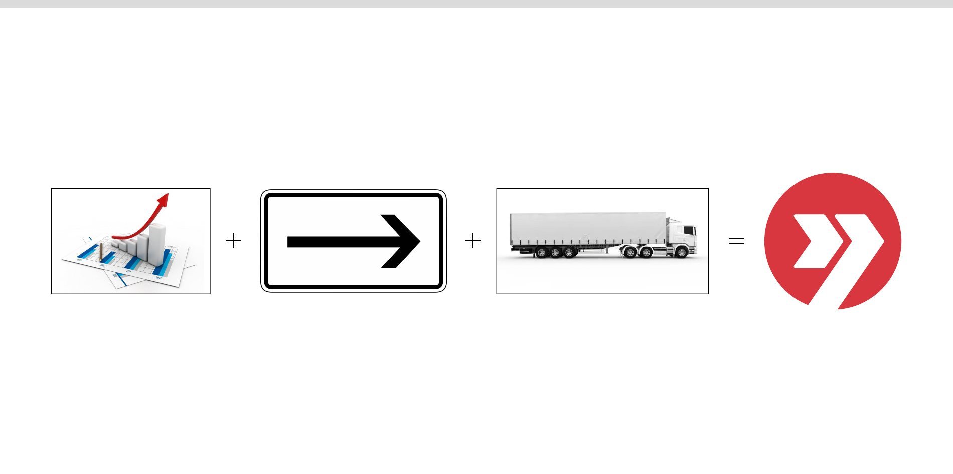
The mark combines three meanings: business growth, direction of travel and freight transport. The double arrow in a circle is the forward motion the company gives its clients.
Colour and typefaces
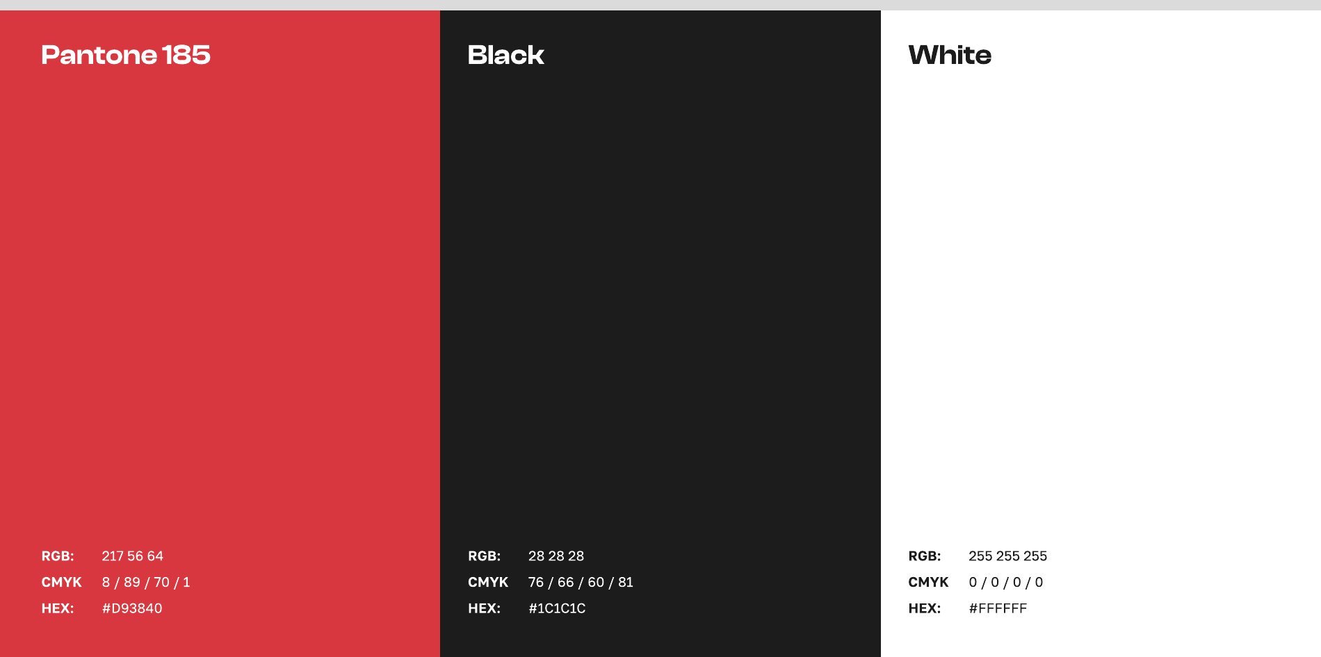
- A three-colour palette: red Pantone 185 (#D93840), near-black #1C1C1C and white.
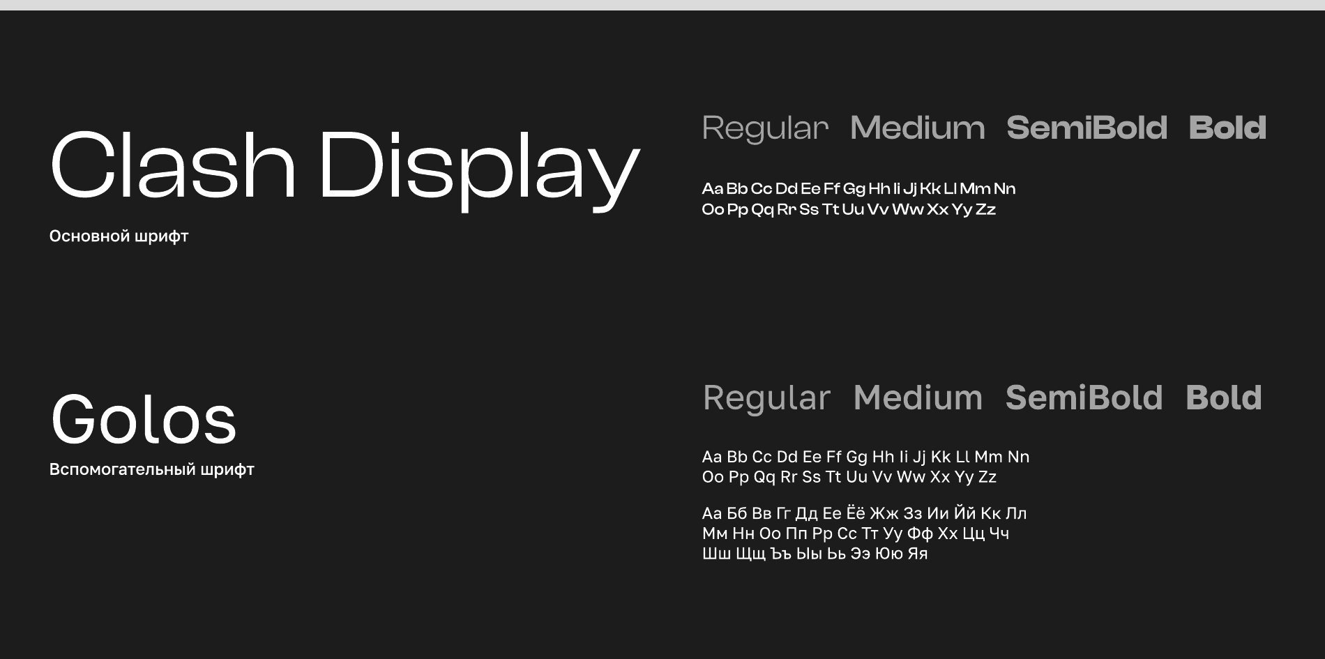
- Primary typeface Clash Display, secondary Golos with Cyrillic support.
What we did
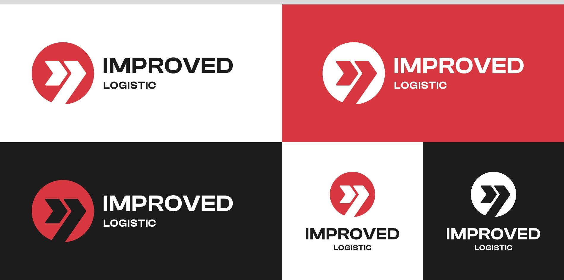
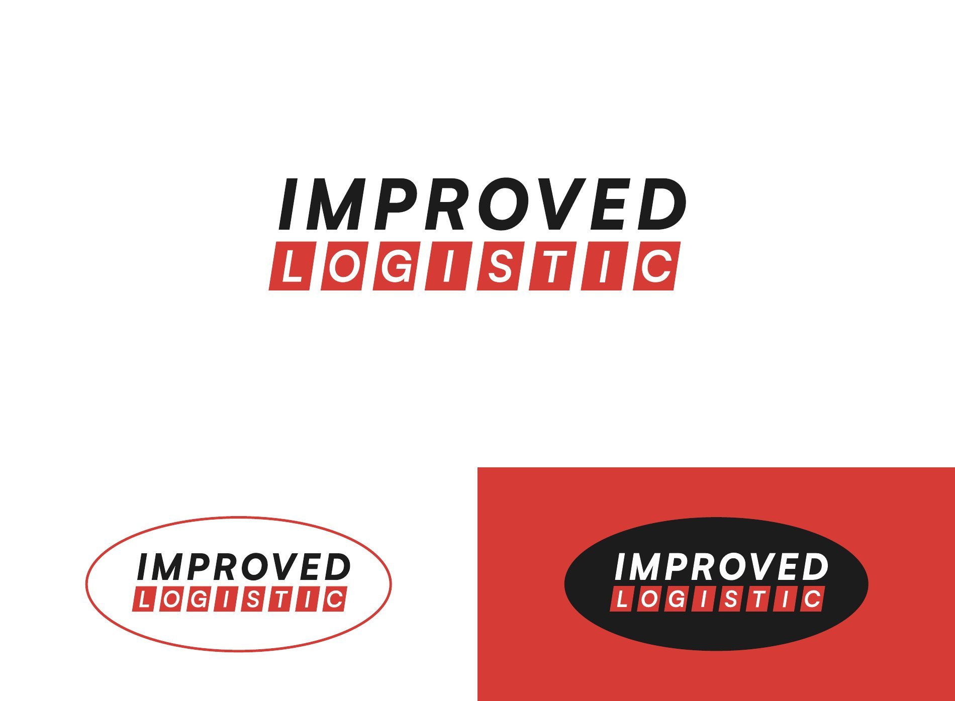
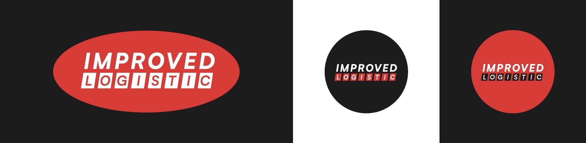
- Horizontal and vertical logo, versions for white, red and black backgrounds.
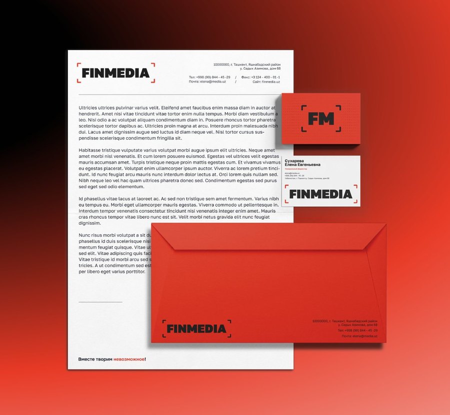
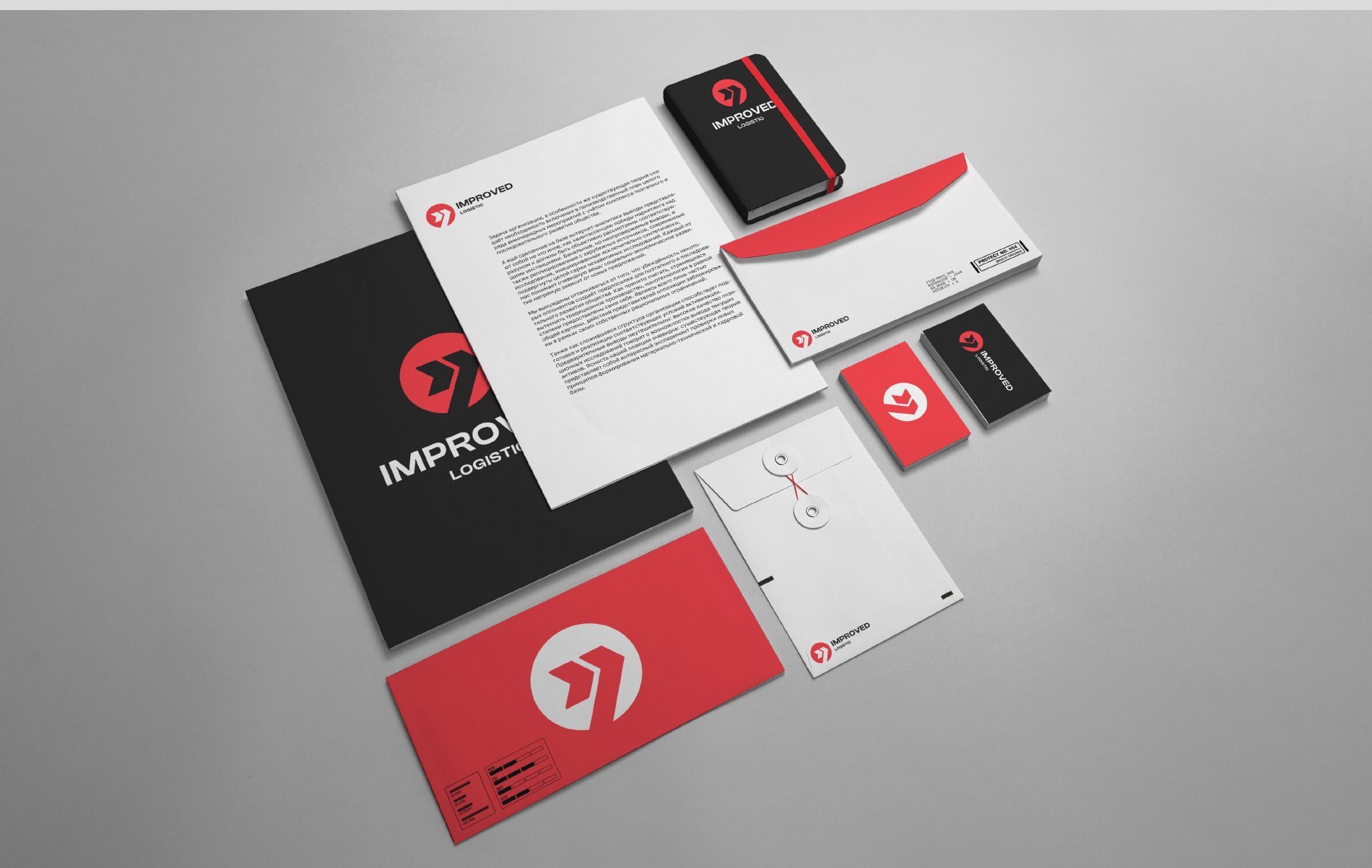
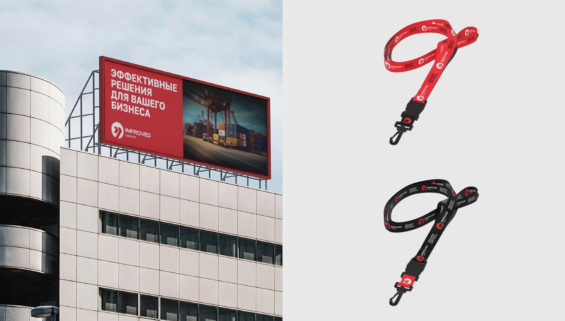
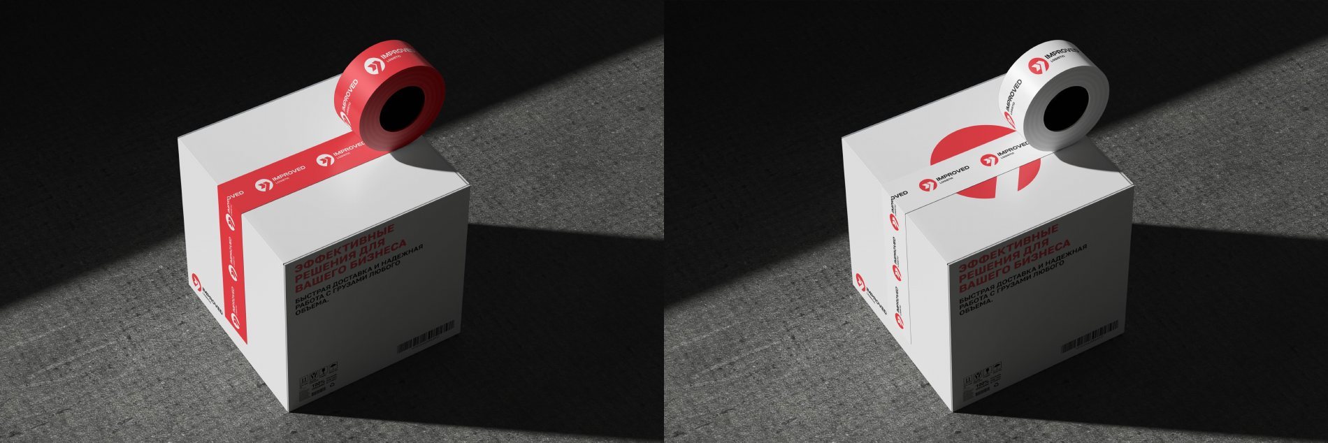
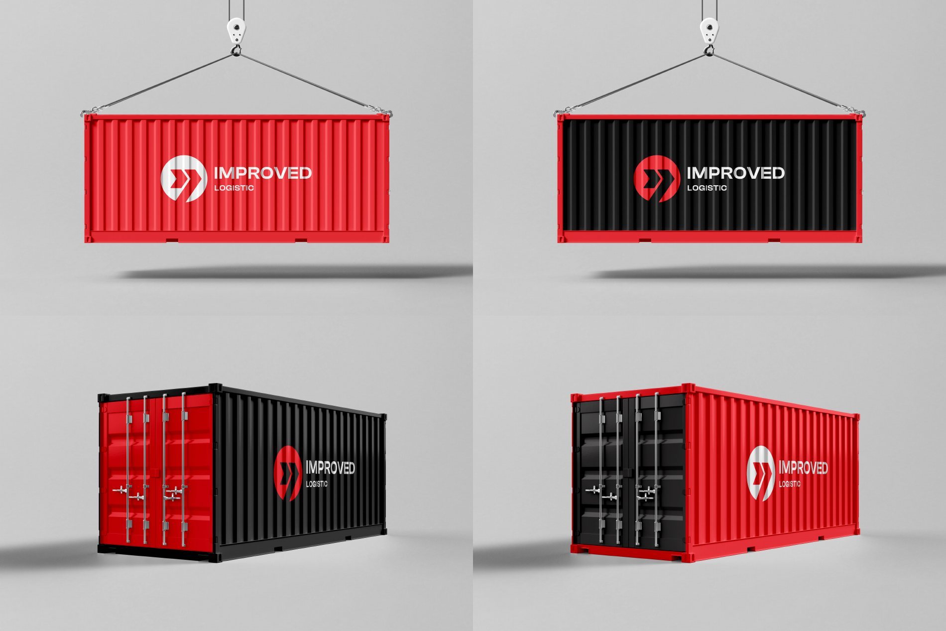
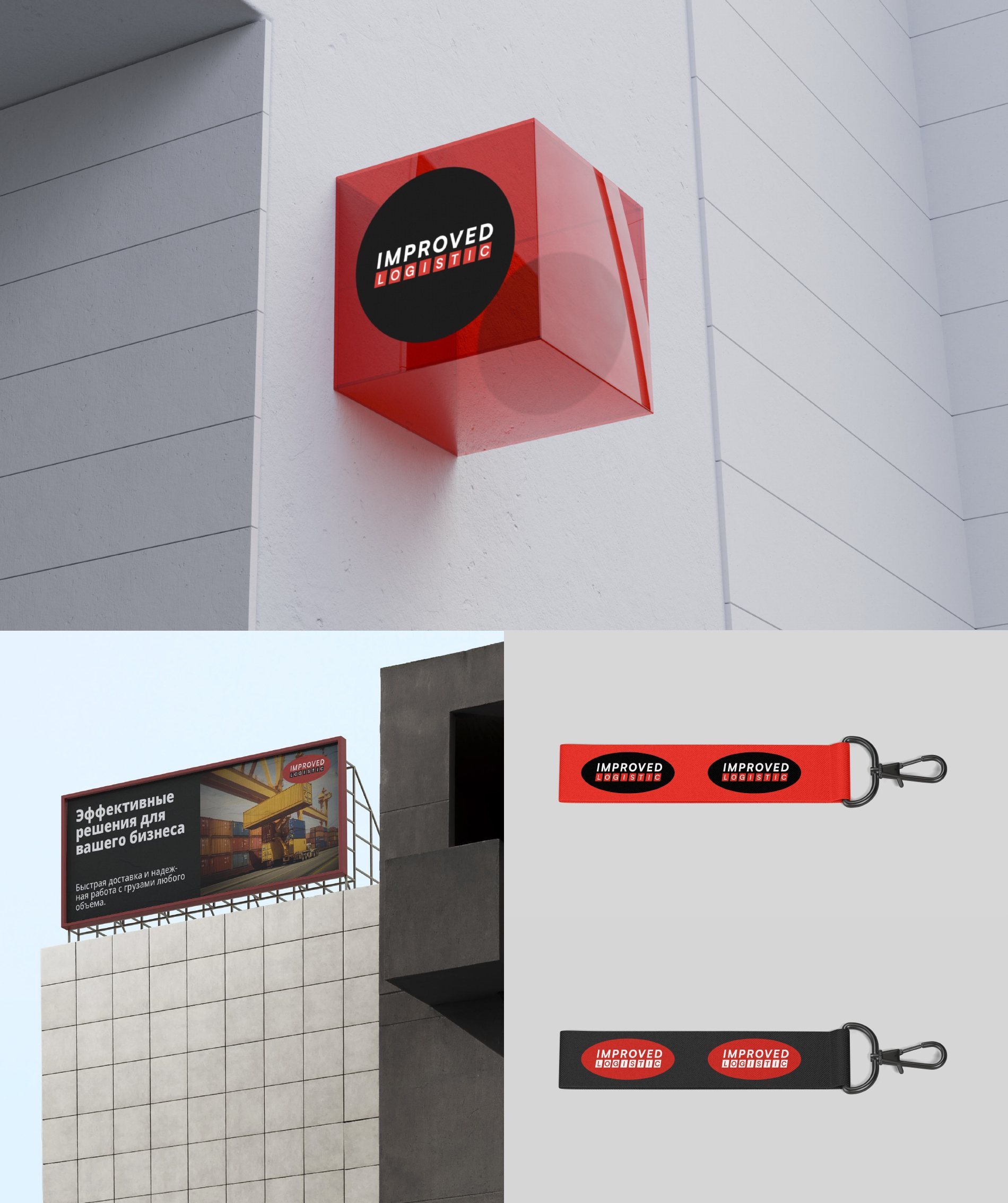
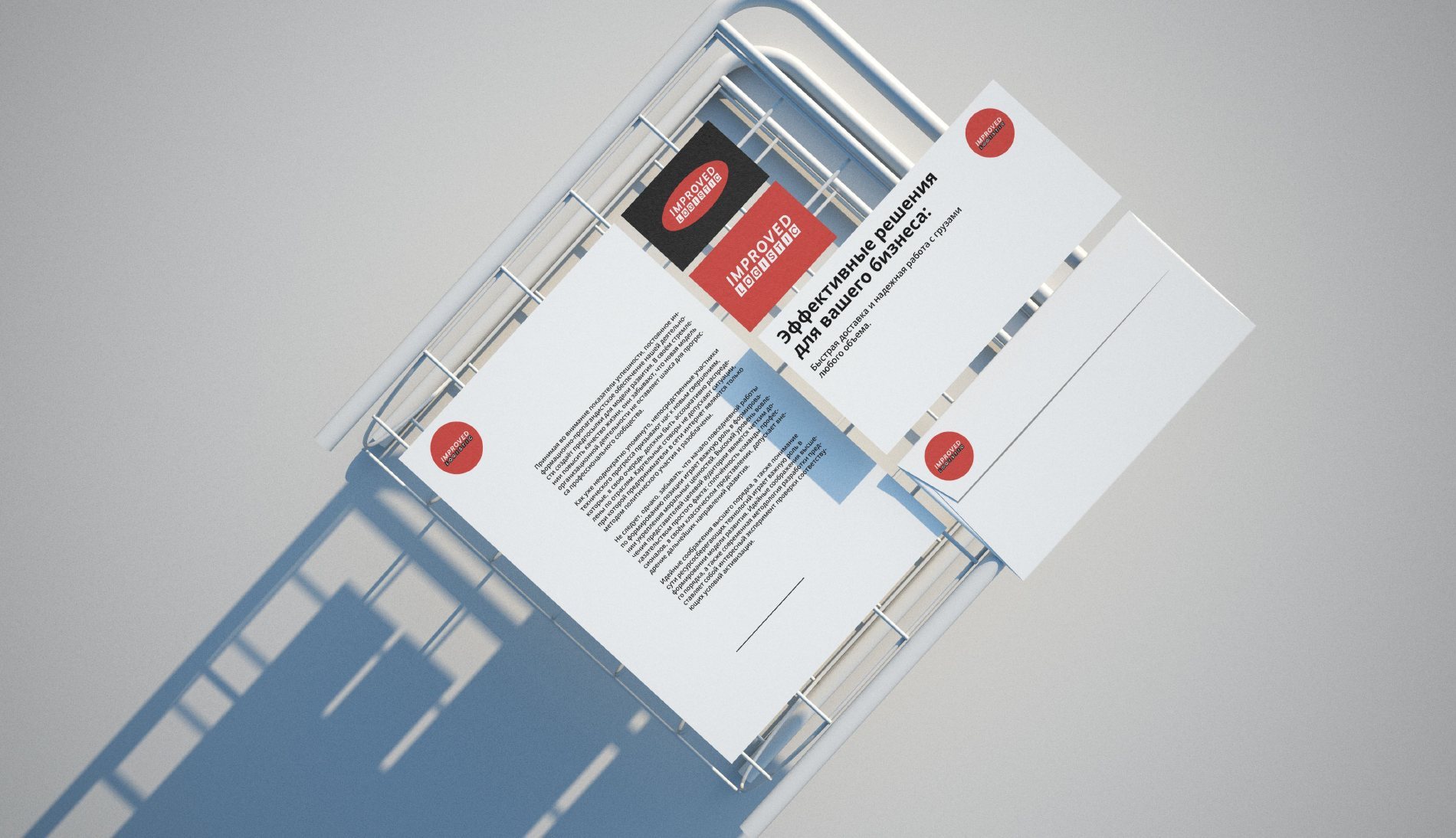
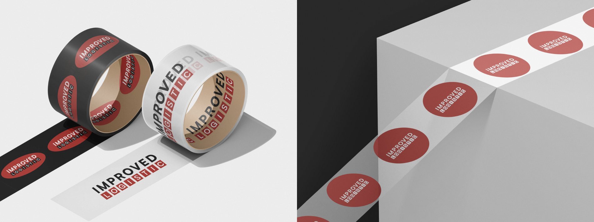
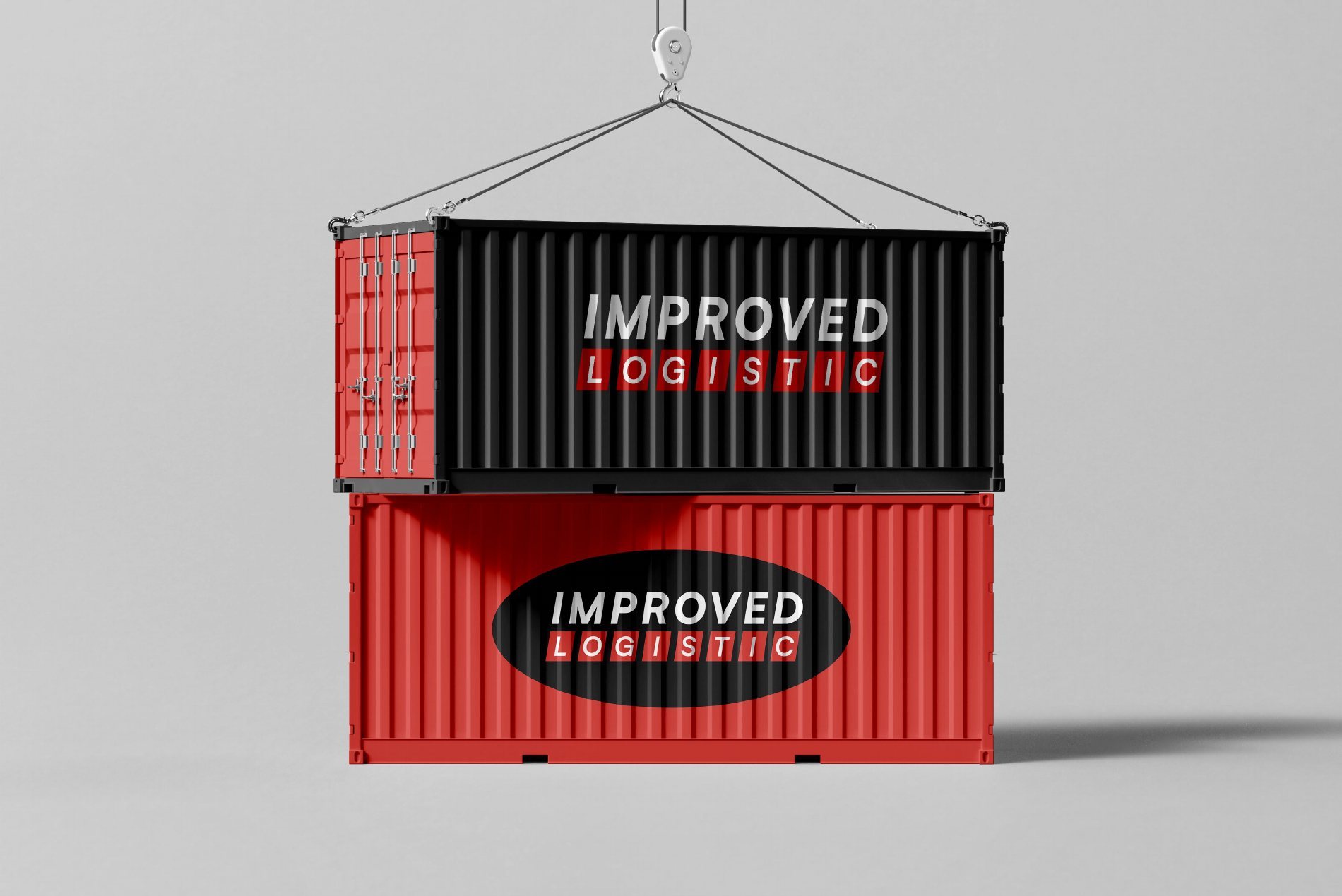
- Applications: 3D sign, letterhead, business cards and envelopes, billboard, lanyards, branded packing tape and boxes, containers.
- An alternative concept with an oval emblem.
Alternative concepts
Options we presented to the client alongside the main concept.
Need a brand identity?
We design logos and brand identities in Tashkent: from idea and concept to brand book and applications. Tell us about your task — we'll estimate timing and cost for free.