Finmedia — logo and brand identity

About the project
Finmedia is a Tashkent technology company working with AI and Big Data, fintech services such as credit scoring, and its own IT infrastructure. Its products include a voice assistant that blocks spam calls and models for traffic analysis.
The company needed a mark that speaks to every audience at once — banks, investors and partners: “we focus on what matters and deliver a clear, measurable result.”


Project details
Scope: logo, brand palette, applications, alternative concepts
Idea
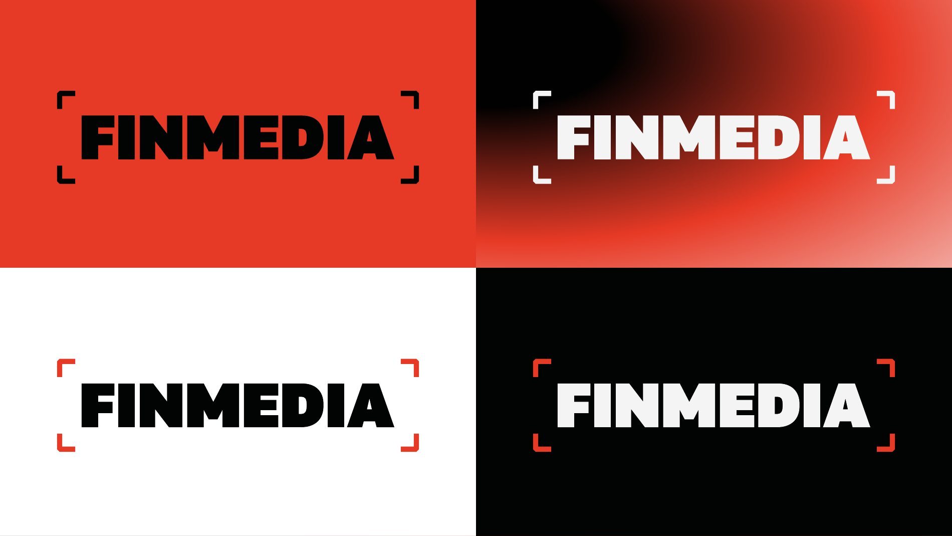
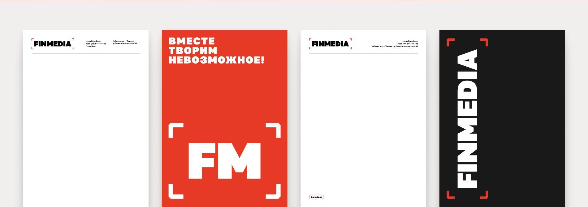
Four corner elements around the name form a “focus frame”, like a camera viewfinder. It is a metaphor for how AI works: out of a huge body of data it isolates the right area and makes a precise decision. For fintech services the frame reads as client assessment in scoring. Inside the frame there is no chaos, just a clear result — the company name itself.
Type and colour
- A massive bold typeface is the visual anchor: reliability, capital and solid infrastructure.
- Red-orange stands for energy, action and leadership — a colour that grabs attention instantly.
- Black brings authority and stability, with maximum contrast and legibility on red.
What we did
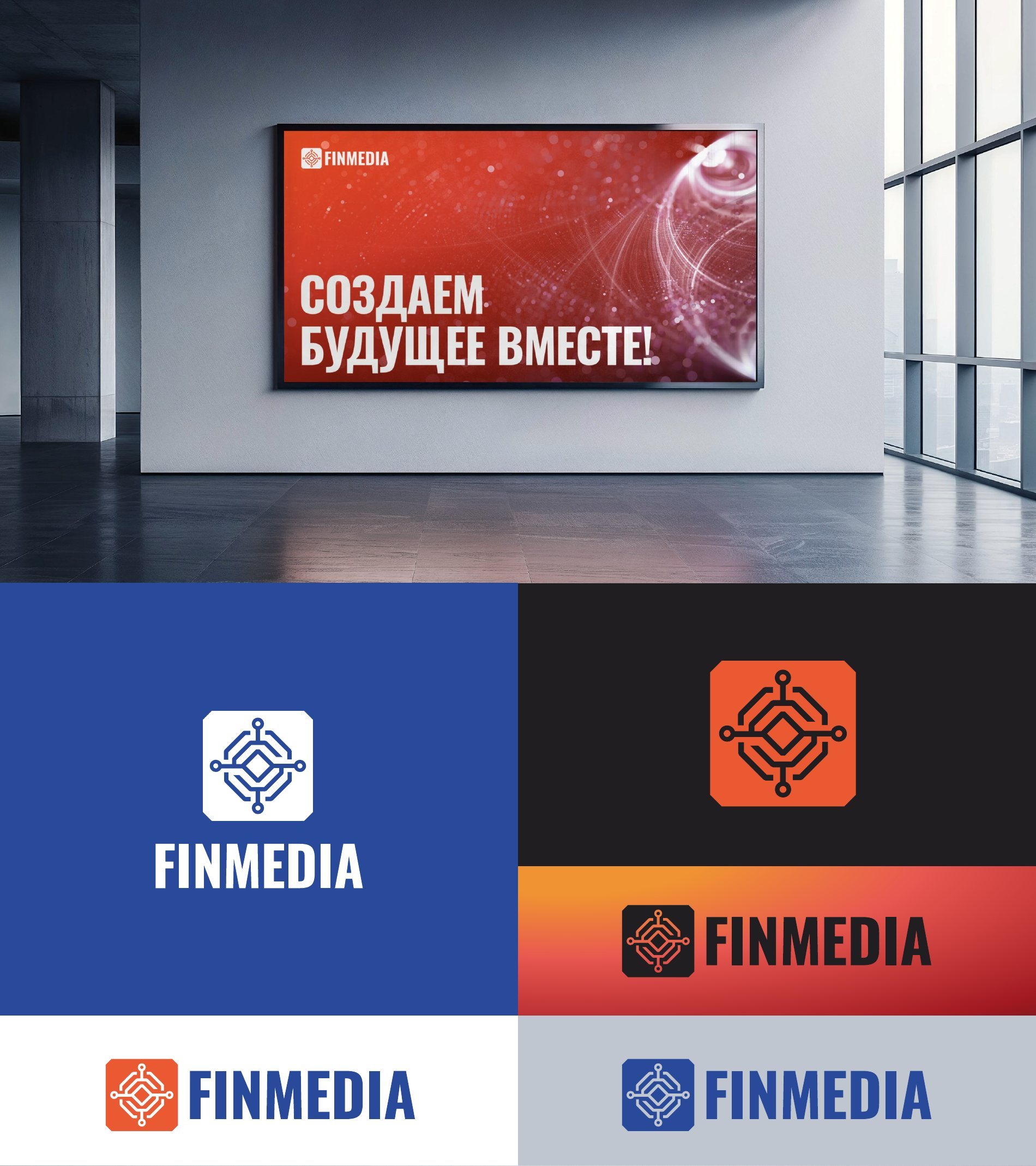
- Main logo and the FM monogram, versions for red, white and black backgrounds.
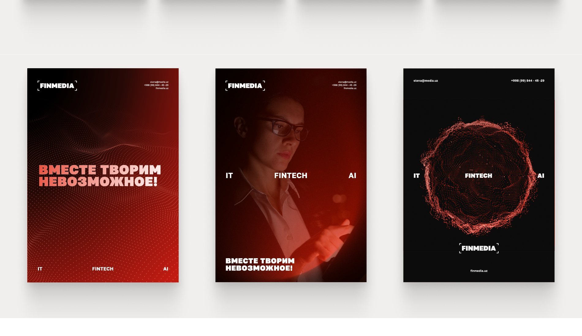
- Brand slogan “Together we create the impossible!”.
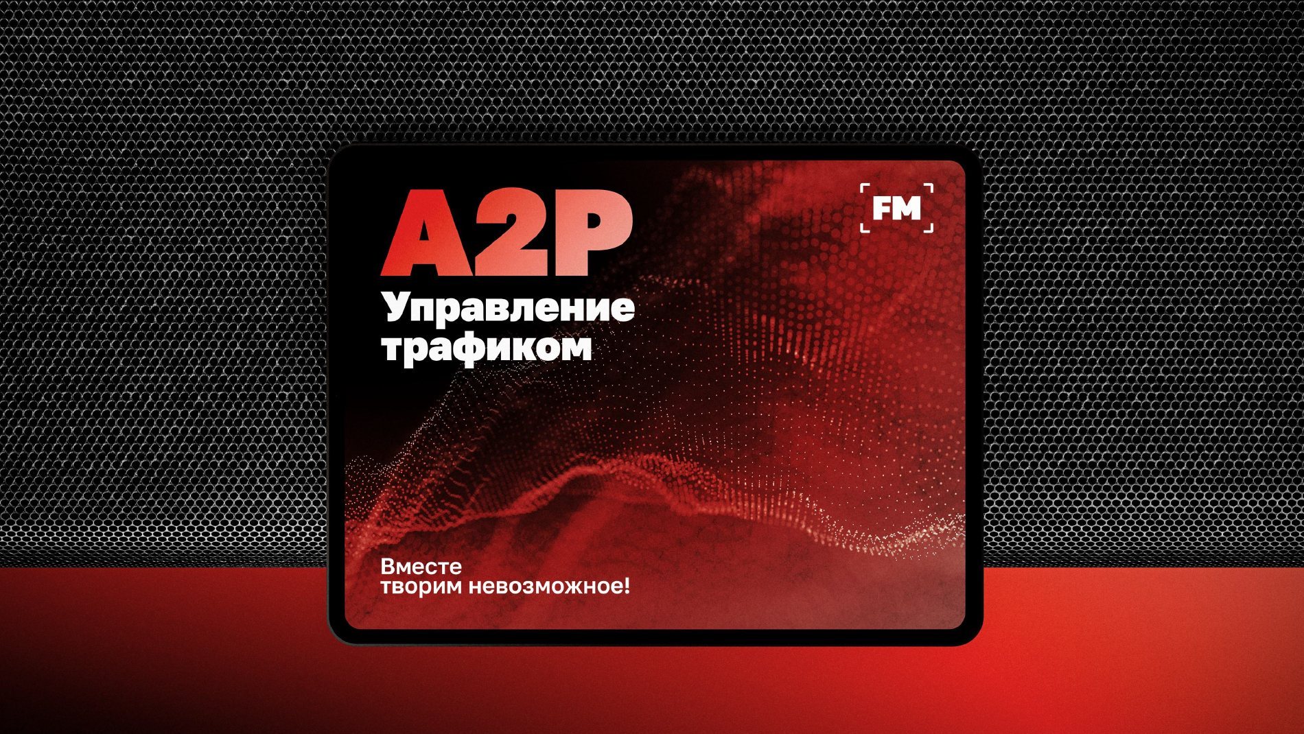
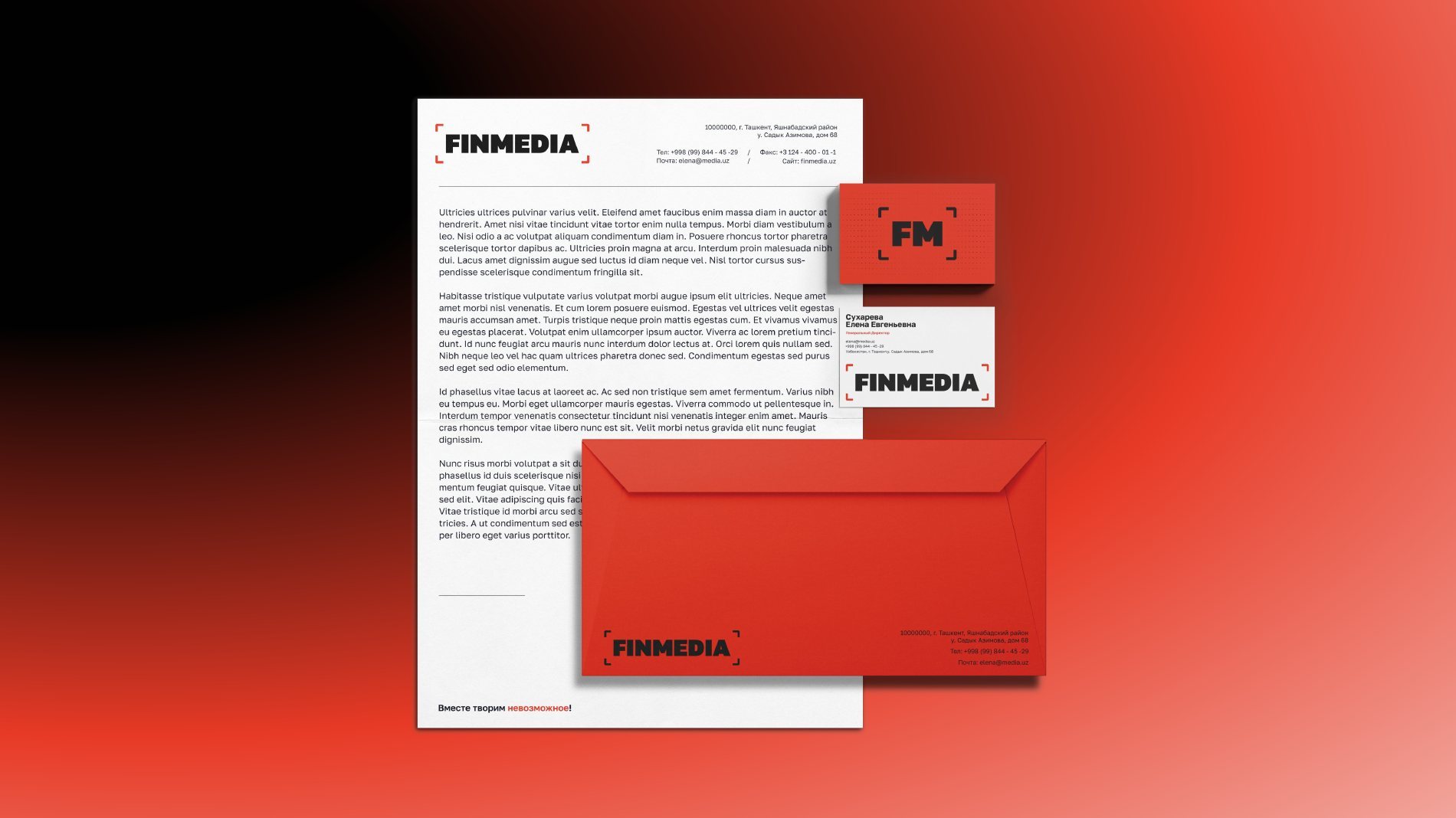
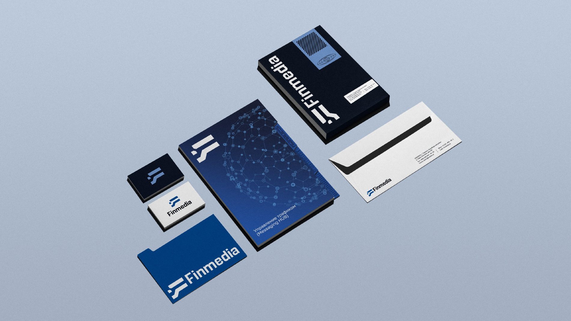
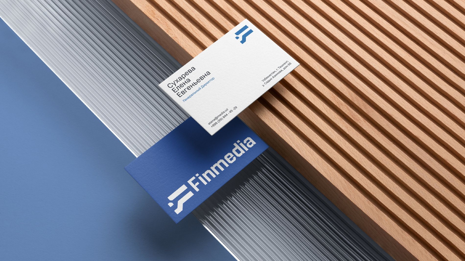
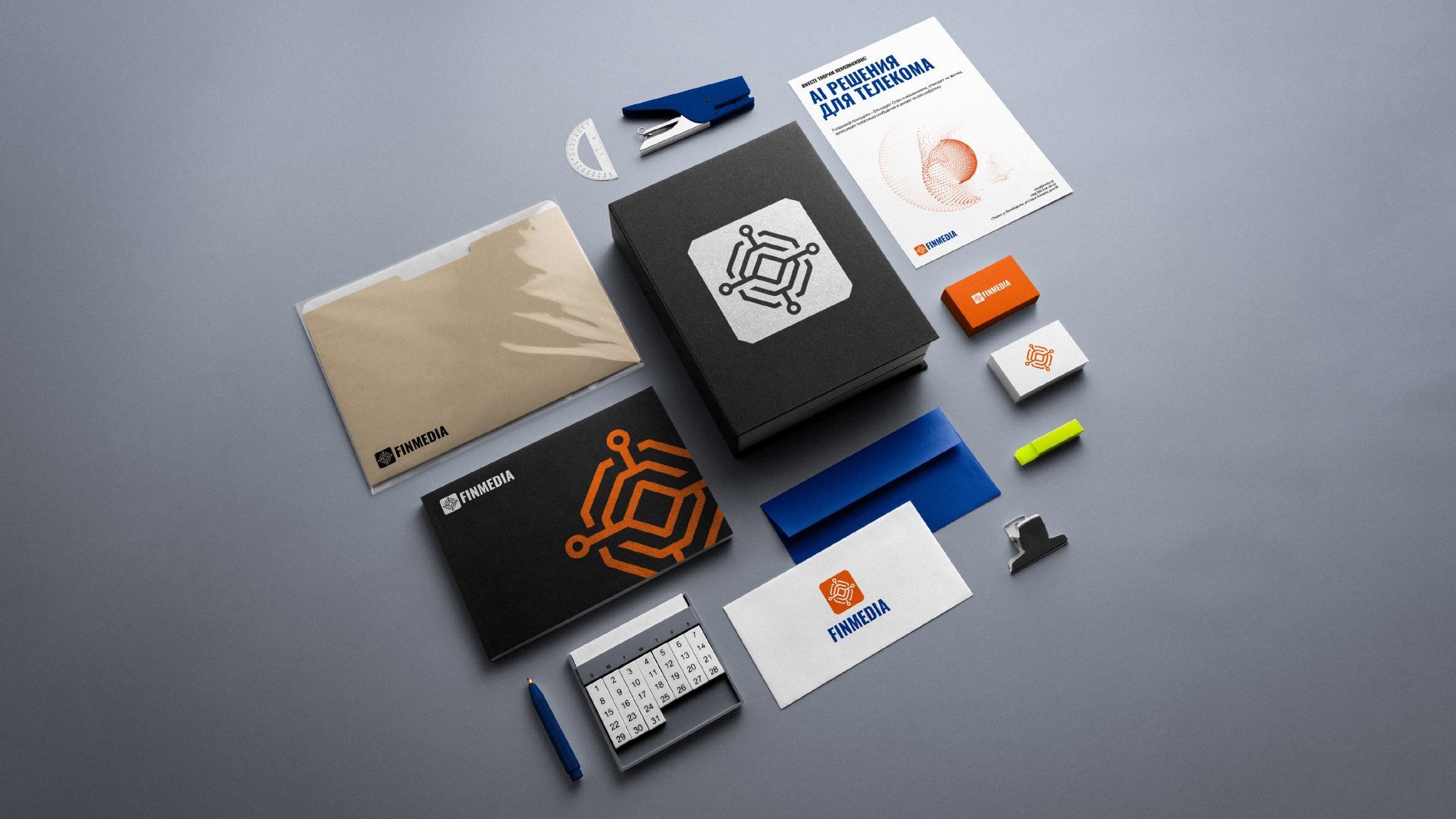
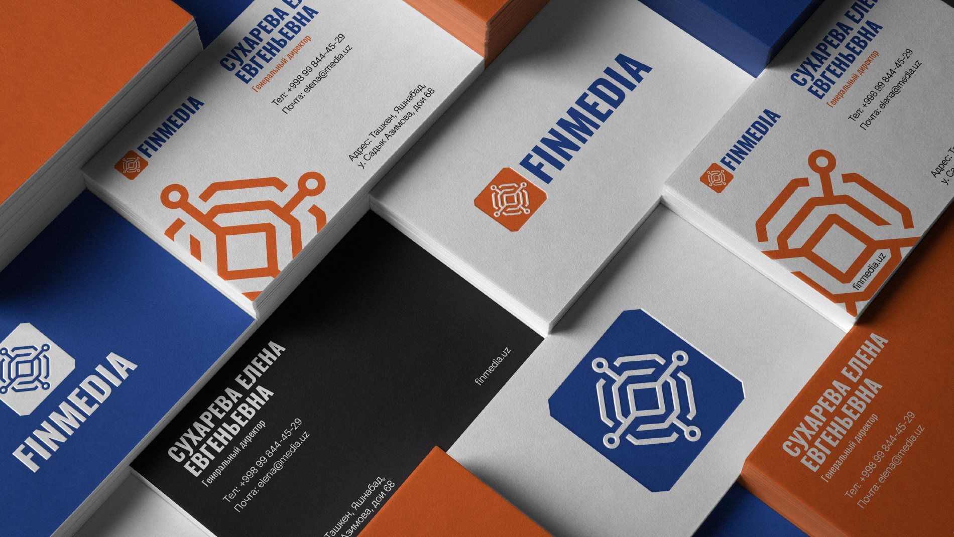
- Applications: letterhead, business cards, envelopes, a presentation for the A2P traffic management product, posters.
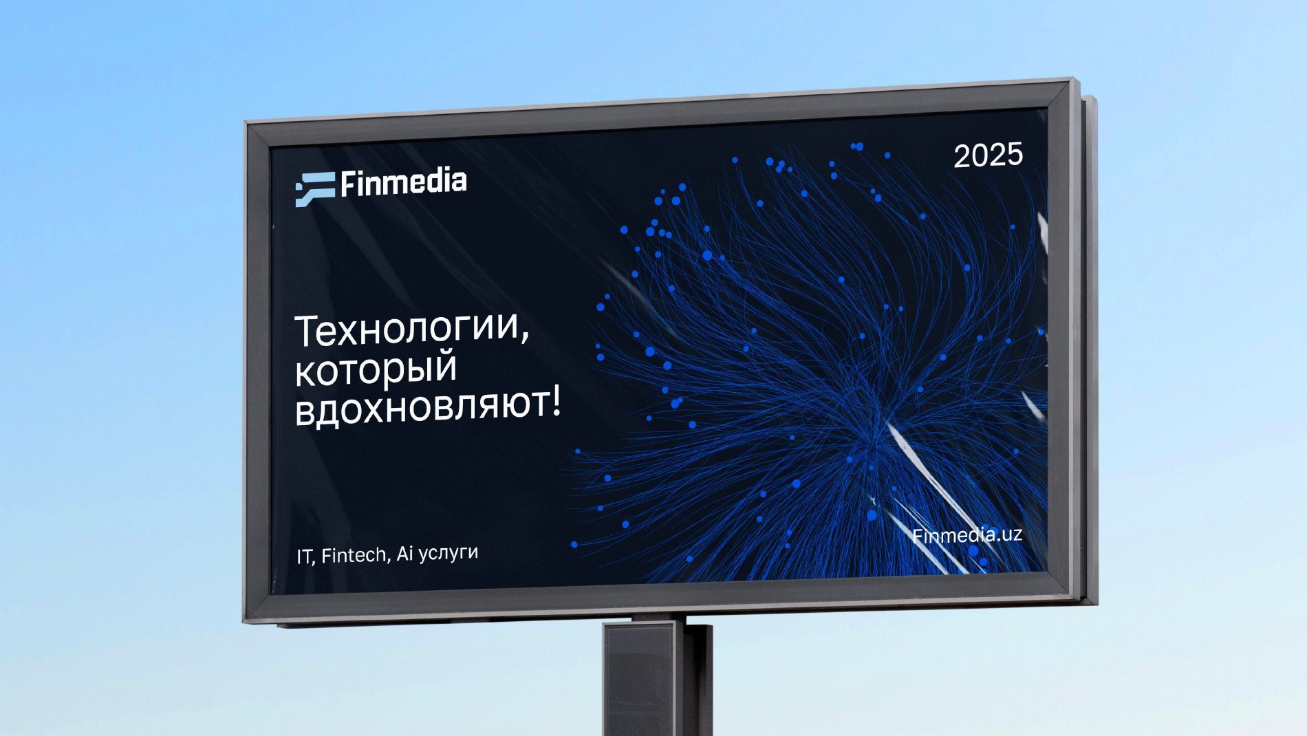
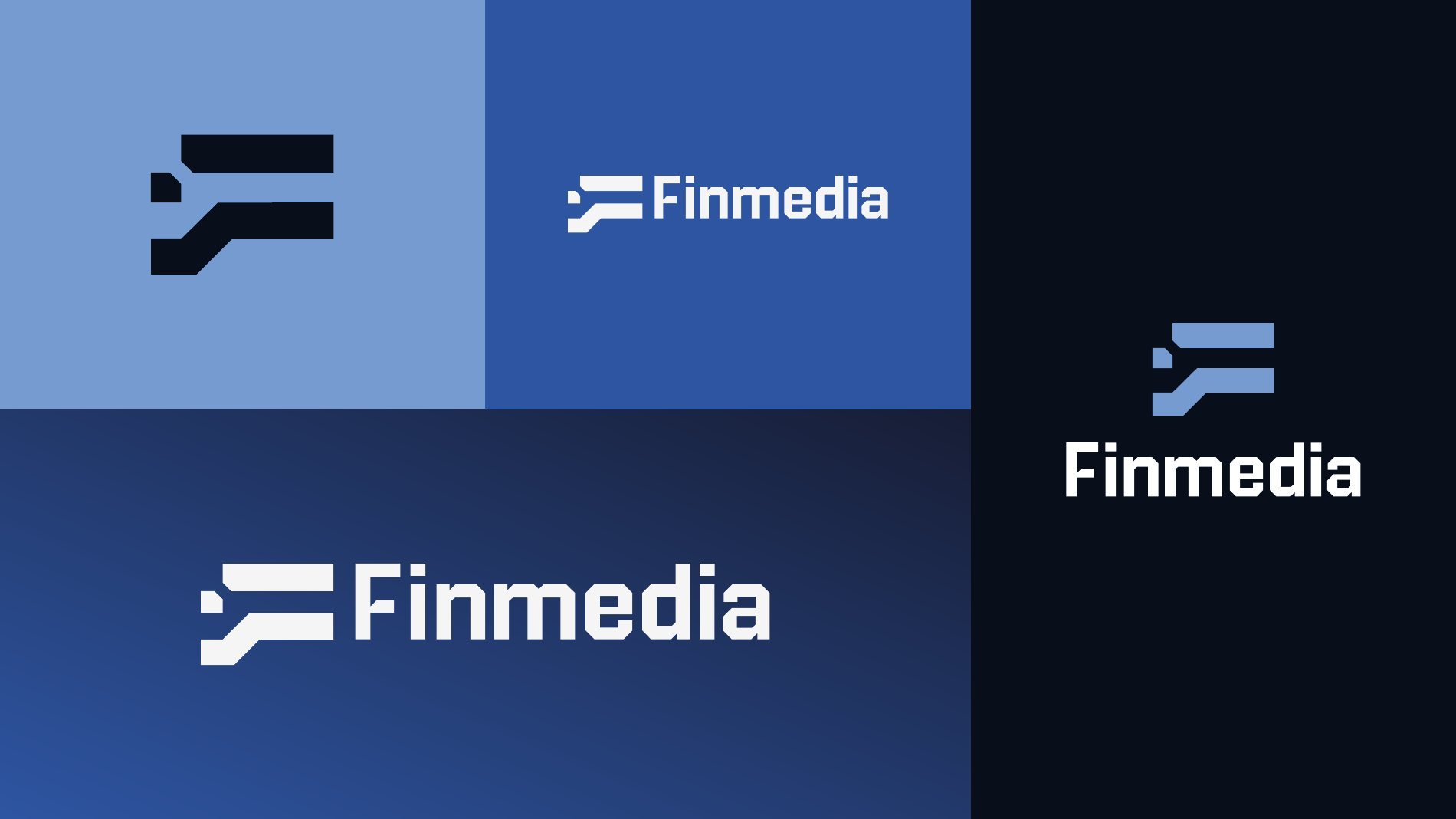
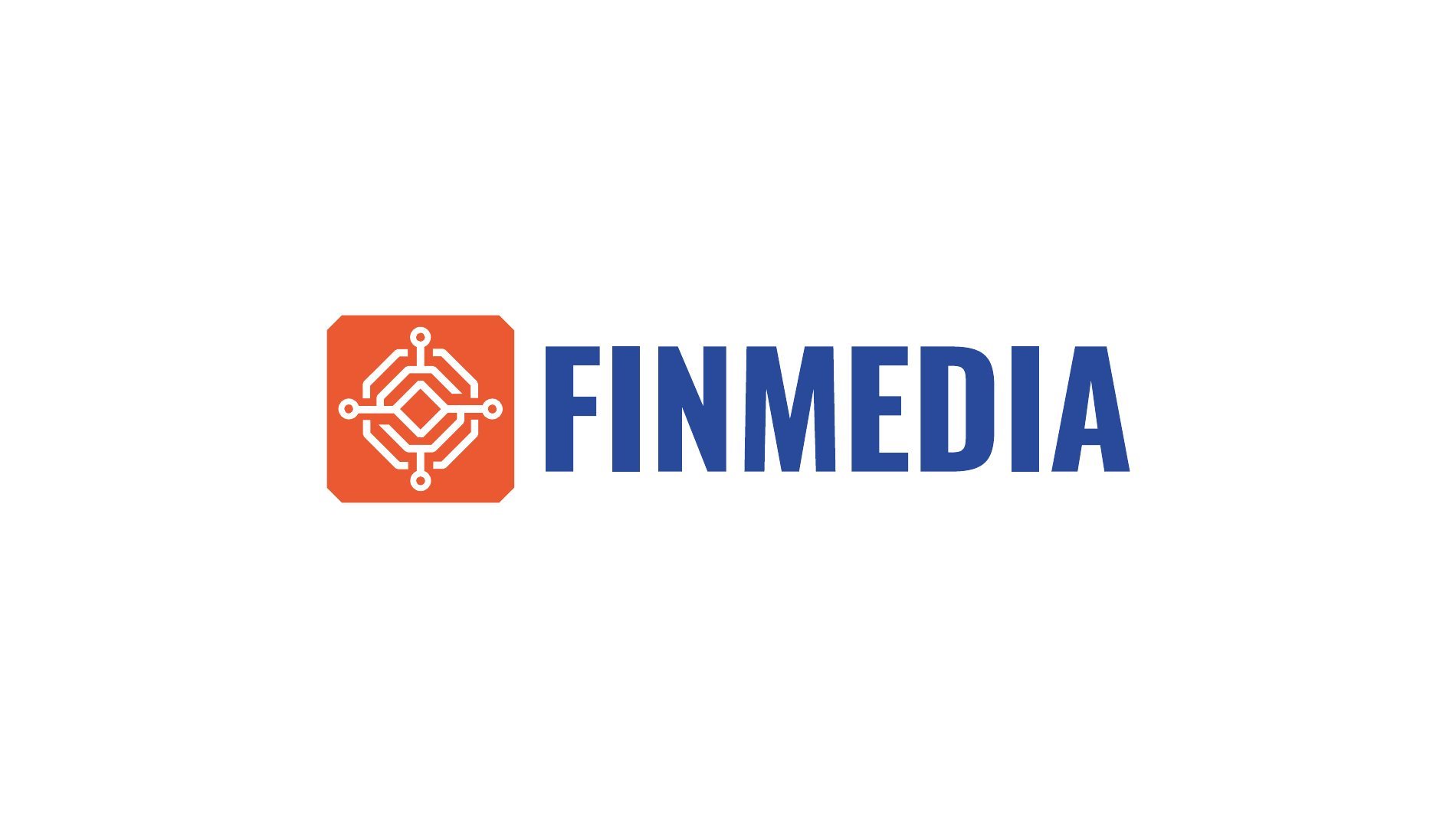
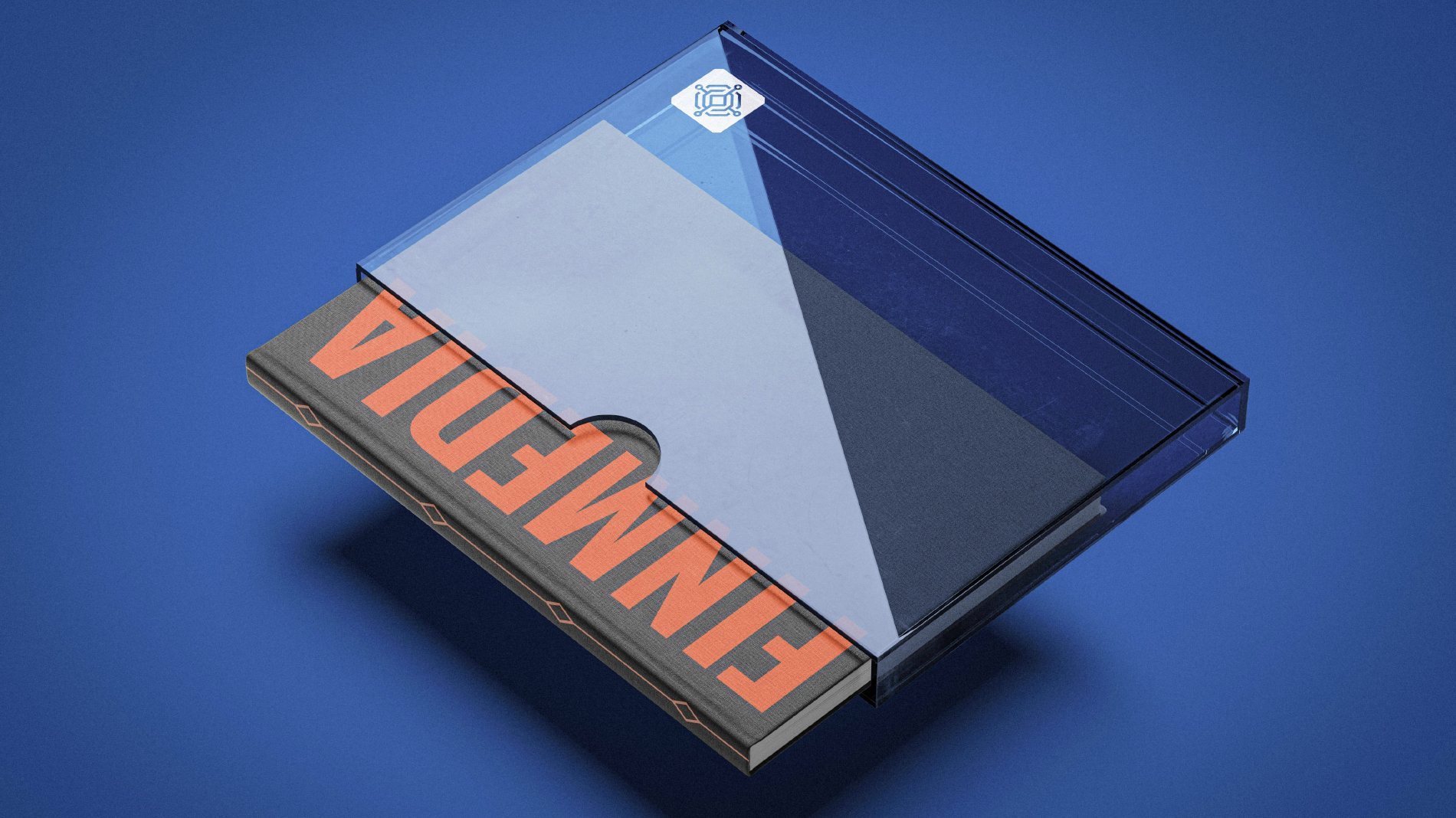
- Two alternative concepts — blue and orange — presented to the client alongside the main one.
Alternative concepts
Options we presented to the client alongside the main concept.

Need a brand identity?
We design logos and brand identities in Tashkent: from idea and concept to brand book and applications. Tell us about your task — we'll estimate timing and cost for free.