Biroo — logo and brand identity
About the project
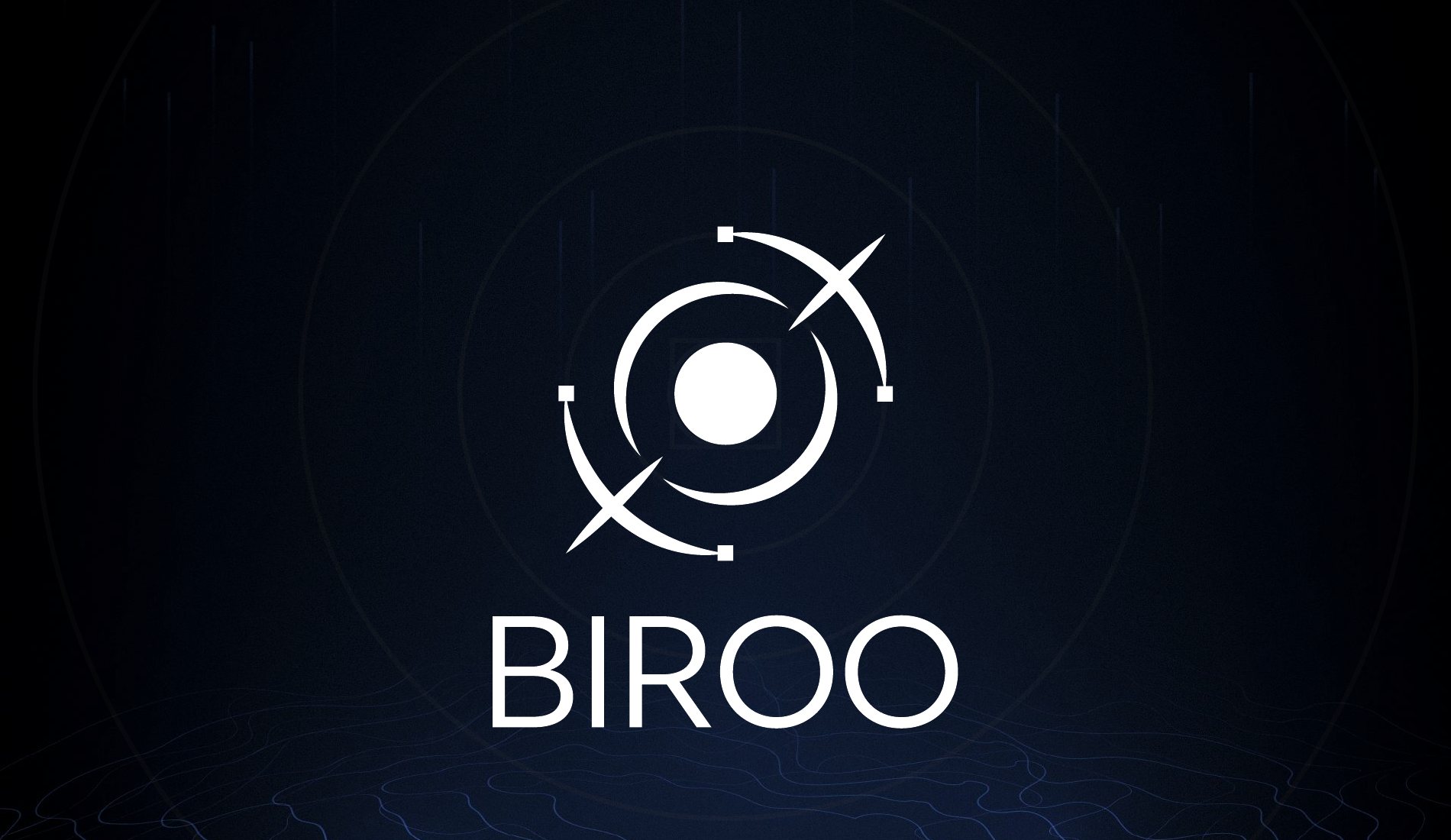
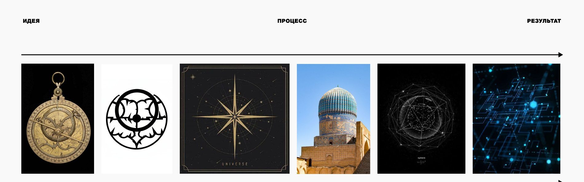
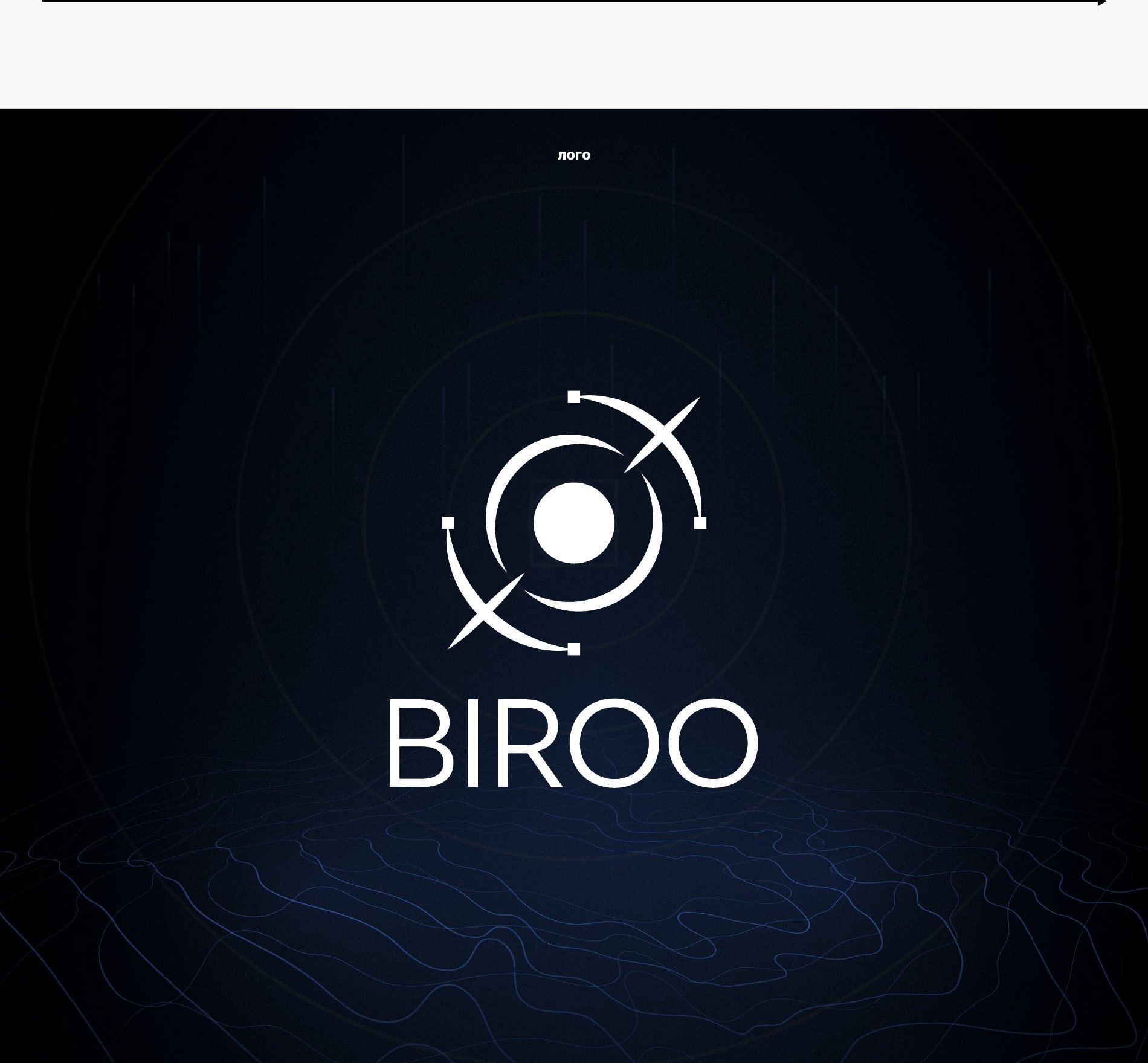
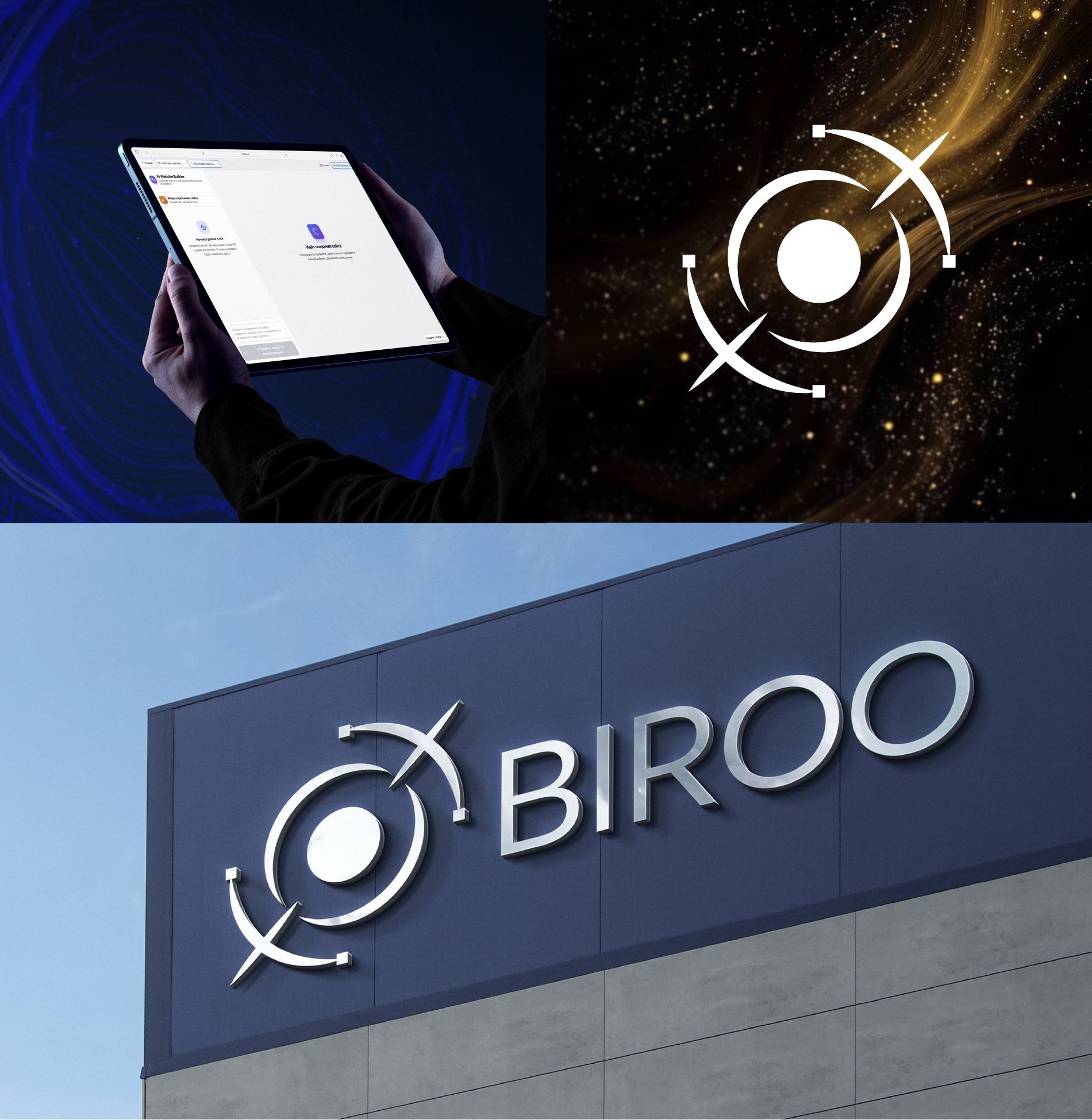
For Biroo we designed a logo and a core brand identity. The work followed an “idea → process → result” path: from visual associations to a mark built on a grid.
Project details
Scope: visual research, logo, palette, typeface, applications
Idea
The starting points were an astrolabe, a compass rose, the dome of a Samarkand mosque and the starry sky — images of navigation, guidance and Eastern science. They led to the mark: a glowing centre and an orbit crossed by a trajectory.
Construction
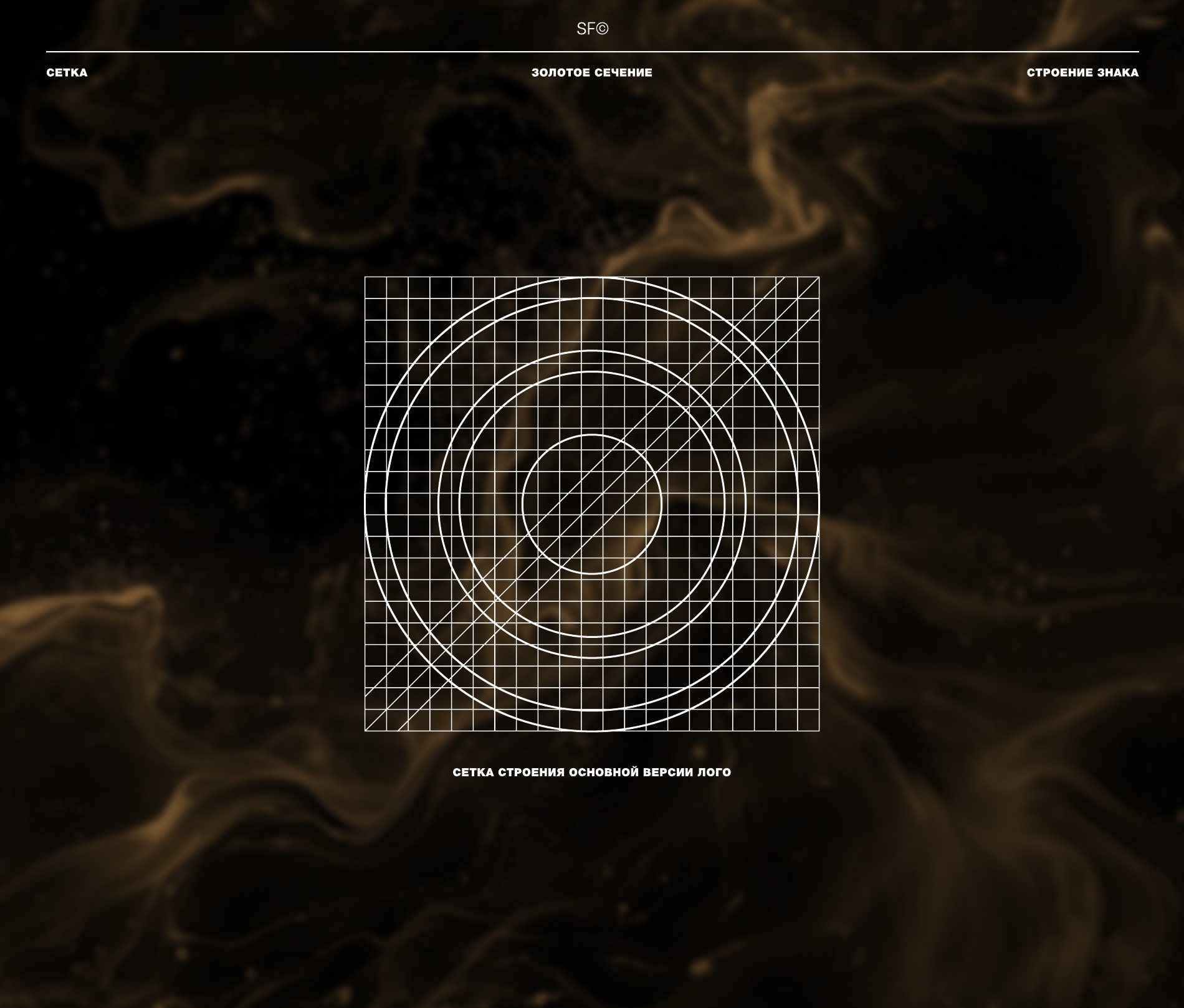
The mark is built on a golden-ratio grid, so it keeps its proportions both at small sizes and on a facade.
What we did
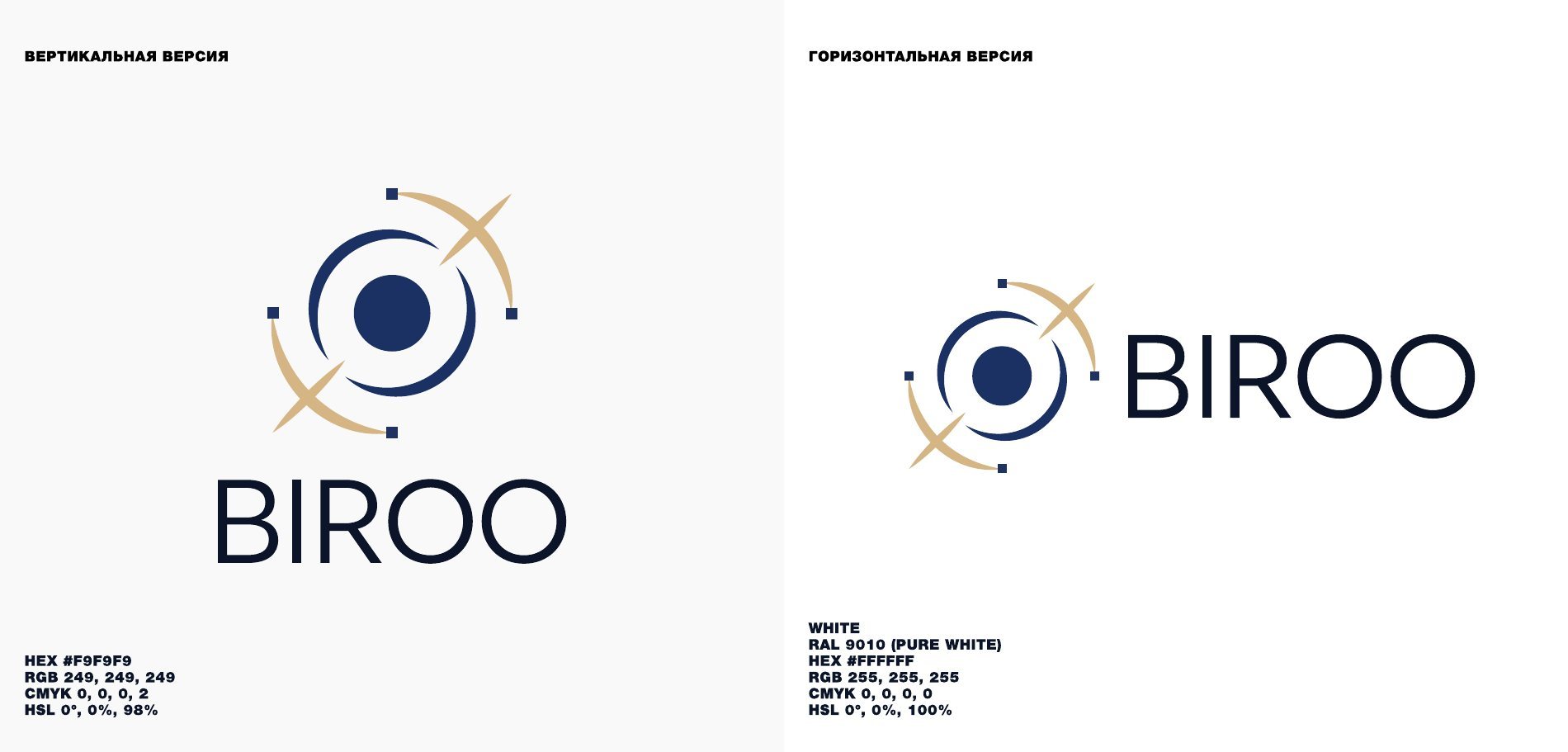
- Vertical and horizontal logo.
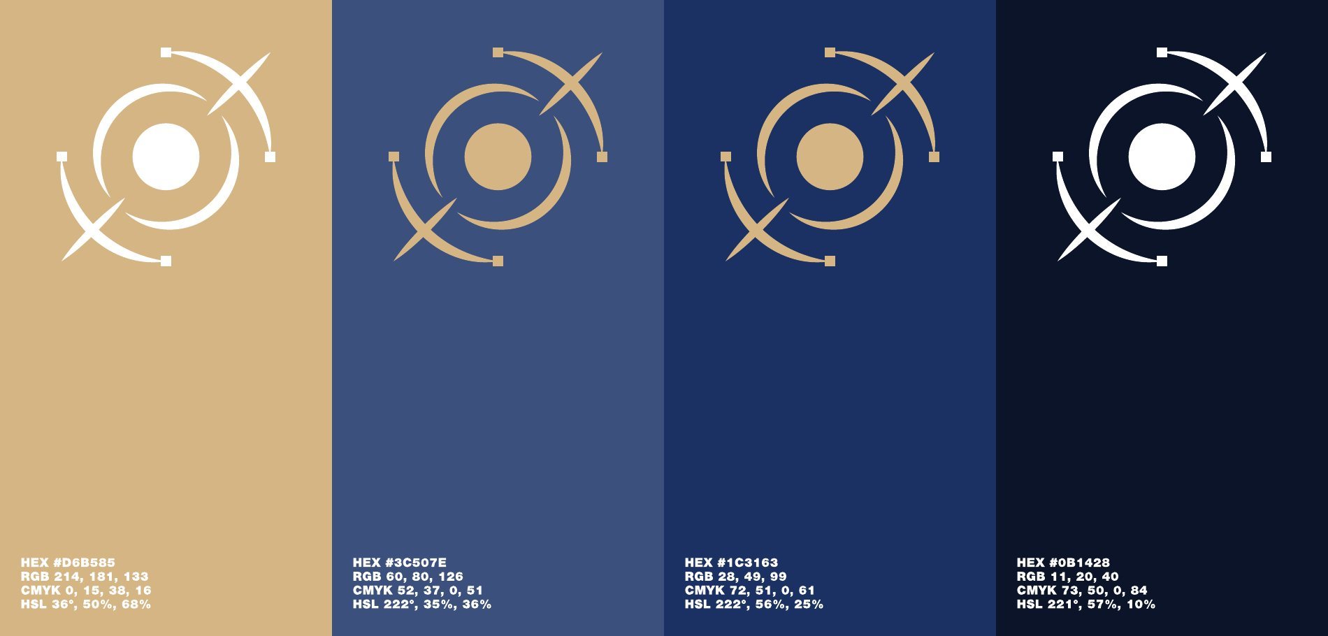
- Palette: gold (#D6B585) and three shades of blue from #3C507E to near-black #0B1428, plus white.
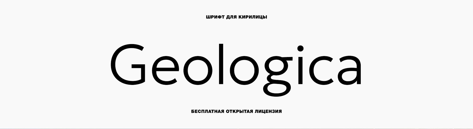
- A Cyrillic typeface: Geologica (free open licence).
- Application examples: a tablet screen and a 3D facade sign.
Need a brand identity?
We design logos and brand identities in Tashkent: from idea and concept to brand book and applications. Tell us about your task — we'll estimate timing and cost for free.